Jamie Gray
I’m really glad I got to spend my summer working with the Office of Energy & Climate Change (OECC). This internship has been fulfilling and it has taught me a lot about environmental work.
I am currently a rising junior at Northwestern University, majoring in environmental science. I’ve lived in Madison since I was three years old, and I really love this place. I’ve also been passionate about protecting the environment since learning about climate change. Faced with the scale of climate change, I feel I would not be satisfied with myself if I did not have a job fighting it. I’ve also been good with numbers ever since I was a kid, and I’ve done data analysis work in the past. That combination of things drew me to work with the OECC as a data analysis intern this summer. I felt at home in this position, and I’m glad I got the chance to work here.
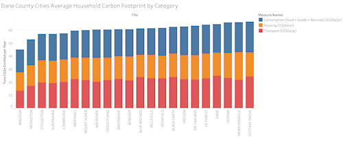
I spent my time at the OECC working with local household-level carbon emissions data. Kathy Kuntz had obtained a set of carbon emissions data from the CoolClimate Network, a University of California-Berkeley, initiative. Kathy tasked me with analyzing the data and making graphs to present it. The CoolClimate data measured the average annual carbon emissions per household, and it had average emissions numbers for five categories of emissions - transportation, housing, food, goods, and services - as well as an overall total. We quickly ended up grouping the last three categories into one category called consumption. The emissions data was aggregated by city, by zip code, or by county.
I prepared some bar charts and scatter plots comparing the emissions of the households in cities in Dane County. I compared each category as well as overall emissions. The graphs showed that Madison households had significantly lower emissions than any other city in the county. We predicted that this was largely driven by people outside Madison driving into the city to work or visit, but that was only partly true. The difference was most pronounced in the transportation sector, but every category had Madison’s emissions lowest. Kathy and I suspect that is due to the higher population density making it easier to use energy and resources more efficiently. Even apart from Madison, there was quite a bit of variation between the households in other cities in the county. Interestingly, the city with the highest household emissions in each category was different. Cottage Grove had the highest consumption and overall emissions, but Morrisonville had the highest housing emissions and Dane had the highest transportation emissions. These results show that the differences between the cities matter for their emissions, and it suggests that households across Dane County can reduce their emissions since the households in other cities in the county have lower emissions.
Kathy helped me figure out how to present the data to a general audience. I would prepare a set of graphs for her, we would look at them together and come up with improvements and new graph ideas, and I would make them for the next meeting. Through this process I incrementally improved my work until it was ready to present. She put emphasis on making sure that the graphs were understandable to people without much experience reading graphs, and made sure I kept them simple to understand. I learned a lot about how to present data to the public, and I think my future work will be better for it.
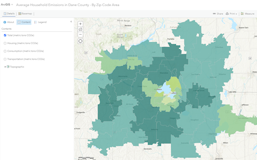
After spending time making graphs with the data, I was itching to try and make maps with it. I trained in GIS mapping software at Northwestern, and I knew this data would be suited to a GIS map. I thought that making a map would highlight the urban/rural divide very well, and it might highlight other trends that we couldn’t see in the raw data. It proved to do just that. The first map I made showed total annual emissions per household divided by census tract, and what leapt out to me was that some of the census tracts with the highest emissions per household were in Madison. Madison as a whole had lower average emissions than its neighbors, but it seemed like that was largely driven by low emissions in student-populated downtown areas. What’s more, the census tracts with the highest household emissions lined up with the Maple Bluff and Shorewood Hills neighborhoods, as well as an area to the west of Madison. I recognized these as high income neighborhoods, so I did a comparison between carbon footprint and income and found a strong correlation. The data showed that carbon emissions were linked more to income than the size of the city one lived in.
Unfortunately, I ran into a problem when analyzing this data. While working with the census tract data from CoolClimate I discovered some inconsistencies so we circled back to the CoolClimate Network team who said that they wanted to re-run the analysis. They told us to use zip code data instead of census tract data while they resolved the issue. However, the zip code data did not separate out Maple Bluff and Shorewood Hills from surrounding neighborhoods, and as a result the connection between income and carbon emissions was muddled. It’s unfortunate that I couldn’t use census tract data, but I couldn’t present a map that might be incorrect. Hopefully the CoolClimate Network will resolve the problem with the census tract data; I told Kathy I would be glad to help finish the census tract maps. Even without the comparison to income, maps proved to be quite useful for presenting the data visually. They allowed for spatial comparisons that graphs could not pull off. I ended up making many maps comparing overall emissions and the subcategories by zip code, some of which ended up on the OECC website.
I am glad that I was able to work for Kathy Kuntz. She played an active role in my work, providing feedback and helping me elevate my maps and graphs into something I could be proud to present. She consistently put in effort to make the work experience better for me and all of her interns. Not only was she a great help with my projects, she also made sure to help her interns with their future careers. She invited the OECC interns to lunch a few times to discuss environmental issues and our future career paths. Getting the chance to talk with her and the other interns was inspiring, and the discussions expanded my horizons. She would ask us about what we wanted to do, offer advice, and help us connect with people to further those goals. She made sure that all of her interns left with a clearer sense of their career path, as well as some connections and example work to help them get there. I am grateful to her for all her help, and I could not have asked for a better boss.
I am really glad I got to work with the OECC, and I wish them the best in their future projects!

Jamie is a rising third-year student at Northwestern University studying Environmental Science. He is committed to fighting climate change and is involved in environmental activism at Northwestern. He is helping the OECC analyze and present data to help implement the Climate Action Plan. He can't decide whether he enjoys spending time in natural spaces or at home with his cats more.
The Dane County Office of Energy & Climate Change maintains this blog as a way to offer:
To be sure that you don't miss new blog entries, subscribe to our email updates.
And learn more about internship opportunities on our About Us page.
